Canalblog
Suivre ce blog Administration + Créer mon blog

Cochesaurus Playground

21 avril 2010

Henry the Tiger

Hi!

I'm sorry because, I've not been able to write that often here in my blog, besides I'm not that creative to write new things and tutorials that often, but that is another story :)

Let me tell you a little bit, of how I've been doing in the last months...Finally I ended one big project that was assigned to me in my job, and so far I learned a lot of things related to training course design, including: recording audio, recording videos, and what I like the most... preparing custom graphics for the courses. At the end, I think the courses were fairly well :) It's worth mentioning that I used mostly open source technologies like Audacity, Avidemux, Blender, GIMP, and Inkscape. The tips I learned I will try to post them here, so you can learn a little bit too.

Ok, lets go with the main topic of this post, the latest of my characters... Henry the Tiger!!

First like all of my characters, I started to draw him in a piece of paper (sketch pad) using my favorite blue pencils (HB, 2B, and 5B). Here is my first attempt: (FIGURE 1)
tiger1

FIGURE 1  My first attempt of Henry.


By the way for inspiration purposes I used a photography of a teenager rock singer to help me draw Henry, and because of that I think my first attempt was too realistic, its like a guy wearing a tiger's costume.

I decided to try again and give Henry a more cartoonish look. I also tried to make the original drawing more simple, just in case one day I animate him. So my second and last attempt its like this: (FIGURE 2)
tiger2
FIGURE 2  The latest version of Henry.


Ok, so far this is not different of what I've done in the past, except that my drawings now have more contrast (thanks to Rore). So I decided to try something different and paint my character using GIMP!! (FIGURE 3)

Henry the Tiger

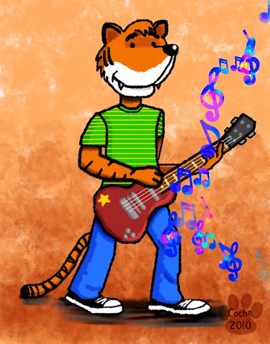
FIGURE 3  Henry the Tiger at full color :)


So far I liked a lot the experience of fully painting a character using GIMP, is not without trouble, because drawing and painting with the mouse is a pain (hopefully one day I'll have a Wacom tablet :) but I enjoyed very much. Let me share some tips of how I painted Henry:

  • I started scanning my drawing (well, really I just took a pic, because I don't have a scanner) and then I imported the JPEG into GIMP.
  • I used a lot of layers. At first I don't think I'll use that much layers, but as I advanced in the painting, I realized that using layers will help me in the long term, e.g. I painted the arm skin in one layer, then the stroke of the arm in another layer, and finally maybe the tiger's stripes in another layer :)
  • I used layer modes (blending modes) to add the shading, and the highlights. I found particularly useful the Multiply, Subtract, and Screen layer modes. Using layer modes also helps to paint without worrying about painting outside the stroke or contour of the shape.
  • Brown color (or sienna), just like in real painting can be very useful to achieve shadings and mixing colors (see previous item)
  • I used some cool brushes (see http://vaults.atomicmonstergirls.net/useful/cornucopia/program-gimp/brushes/)

It's not over yet... :D  like I promised in my previous post, here are my first set of brushes, I hope you like it and find them useful.

Coche's Brushes (compressed with 7-Zip)

Publicité
24 janvier 2010

Time to share!

Hi guys and maybe some girl out there :)

Like some people know, I work in an airline, particularly in the training department creating stuff for maintenance technicians. In the last course that I helped to create that is about "Repair Stations" (if the title looks scary, the content of the manual is more scary). In a way to help to avoid pain to maintenance technicians that study the course, I created some pictures and stuff for the course, and one of the things I did are these tools, and this time I would like to share it with you, I hope you find them useful.

Repair Tools

Inkscape source file:repair_tools

I started to use this license thing, and is as follows: Creative Commons License
This work is licensed under a Creative Commons Attribution-Share Alike 3.0 United States License.

Don't worry about this license thing, it provides a lot of freedom for you to use this work in any way you want

* In the next post I will share my first "GIMP brushes"

** If anybody knows how this tools are called in English (or French :) I would appreciate if you can tell me in the comments. I only know how they are called in Spanish (Desarmador y Llaves)

8 décembre 2009

Highlight Zone

Hi, how are you? I hope you are fine, and if you've been visiting my blog looking for some nice and easy tutorial and don't found any new tutorials, I'm sorry because I've not written in a while. I promise I will try to write more often :)

OK lets start...

It would be nice if you and me had an personal aircraft, don't you think so? just like famous rock bands like Iron Maiden. Lets dream a little and imagine... if you would have an aircraft you've probably were the pilot of the aircraft (although, that requires a lot of study and practice), you can fly everywhere you want and you can decorate and paint your aircraft with the colors, shapes, logos, and embellishments that you like the most. Dream just like Open Source Software is free after all :)

So for this tutorial I've drawn my personal aircraft and the name of my airline is "Cochesaurus Airlines", cool name huh. (FIGURE 1) (actually I've just modified an aircraft drawing that I did for the company that employs me).

Cochesaurus Airlines

FIGURE 1  Cochesaurus Airlines - first aircraft.


Now that we have our aircraft drawing, suppose that we want to highlight a zone, maybe for identifying the location of a component, or perhaps a "bump" after our first flight (since we are learning to fly, maybe a bird hit our fuselage). Create a new layer (transparent) and pick the Ellipse tool and draw a circle on the desired location of your drawing. Keep the selection (keep the ants running) and prepare a nice color for your highlight (I prepared a nice green), using the foreground/background colors in your toolbar. Drag the new color from the toolbar to the selection. (FIGURE 2)

hz1

FIGURE 2  Drag the color to your existing selection.


Keep the "ants running" and go to menu Select > Shrink. In the dialog select 2 px. Now hit delete to erase the color (after this step you will get a "green ring"). Add a new layer and drag the same green color from the toolbar to the current selection in the new layer. Change the opacity to 40 for the new layer. Now stop the ants (go to menu Select > None). Select the top layer (which haves the semi-opaque green), right click it and select Merge Down, now our highlight zone is in only one layer. (FIGURE 3)

hz4

FIGURE 3  Our semi-opaque circle (the stroke is opaque and the fill is semi-transparent).


Rename the layer which contains the highlight to "highlight" and go to the menu Layer > Autocrop layer. Now comes the cool trick... Keep the highlight layer selected and go to the menu Filters > Distorts > Erase every other row. (FIGURE 4)

hz5

FIGURE 4  Erase every other row gives a nice touch to our highlight zone.


Erase every other row gives a nice effect itself, but maybe the color needs to be enhanced a little bit, so duplicate the highlight layer and change the layer mode to "Grain merge" for this layer. (FIGURE 5)

hz6

FIGURE 5  Enhance the colors using a duplicate of the original highlight layer.


And just like Michael Jackson, this is it. I hope you've enjoyed the tutorial, check the final image below. (FIGURE 6)

e190_coche_highlight

FIGURE 6  Our green highlight zone is complete!


* The aircraft showed in the picture is a "Embraer 190" a nice aircraft manufactured in Brazil.

** The highlighted zone is where the "Fueling Panel" is located in the aircraft.

8 août 2009

Painful Source of Inspiration part 2: Greeting Cards with Stylized Smoke

Hi,

I'm having some troubles writing to this place, my blog, but I hope I can continue to share my thoughts and tips with you for a long time.

Ok, so in a previous post I said that I 'll write about my not so well experience with a girl and here I go...

I think most of the things are said in the previous post, only the conclusion and what I learned remains. I want to start with the following quote:

"Why so serious?"

-The Joker (from the movie The Dark Knight)

The following quote can explain this better:

"The most important thing to remember is to always remain calm, confident, and playful about the whole thing. This is a stranger, not your longtime girlfriend. Don’t treat her like she’s the only thing in the world that will make you happy…you don’t even know if she’ll make you a little bit happy at this point. You’re just making an earnest effort to get to know someone new."

-Zack Taylor (from the nice web site "Dating and Thoughts")

And that is what happened to me, I get so serious too soon and I forgot to have fun. I think the opposite is true, first don't forget to have fun, later if the things work out, then you can get serious.

Ok, let the tutorial begins!!

This time we'll do another nice and easy to do greeting card.

First, grab a nice picture that you think your friend will like. I chose a nice picture of McWolf from the Tex Avery classic cartoons. (FIGURE 1)

wolf5

FIGURE 1  A cool character...Tex Avery's McWolf.


Now is time to modify the original picture, I did a soup bowl in Inkscape and then I imported it in my GIMP file. (FIGURE 2)

soupbowl

FIGURE 2  My soup bowl!


After this add the text balloon that will contain the special message for your friend. To draw the text balloon, use the Ellipse Select Tool to draw the initial shape, and then with a solid circle brush draw some strokes in the contour of the shape. To complete the text balloon, add some circles in diminution targeting the mouth or head of the character. (FIGURE 3)

textballoon

FIGURE 3  The text balloon.


When you've completed the text balloon, its time to add the text using the Text Tool. (FIGURE 4)

text

FIGURE 4  Adding the text.


Now it comes the cool part of the tutorial... adding some stylized smoke to the soup, just to make it more delicious! And is really easy, just grab the Airbrush Tool and choose a Circle Fuzzy brush with a convenient size, I chose Circle Fuzzy (13). Then set the Brush Dynamics, check the size option under the Random category and draw some strokes to make your smoke. (FIGURE 5)

smoke

FIGURE 5  Our nice smoke makes the soup more delicious!


Lets see the final result: (FIGURE 6)

soup

FIGURE 6  Our final greeting card.


And that's it, cool and easy tutorial huh.

See ya soon.

* by the way, the soup that appears in the picture is a traditional soup from my country called "Sopa de Pata" or Soup of Legs, is a delicious soup made from cow's legs, maybe it sounds not so appetizing but is really delicious!

29 juin 2009

Chalkboard

I think I will post later, the second part of my Painful Source of Inspiration series, because I need to re-organize the order of events and my thoughts about that :D

Ok, let me share with you some tips about this chalkboard that I did some weeks ago. (FIGURE 1)

Chalkboard

FIGURE 1  Teacher's day chalkboard.


Initially I made this chalkboard to put it in the home page of the Moodle LMS that we use in my job, but like many times have occurred to me in the past :( I was told to remove the chalkboard from the home page. So I decided to store it. A couple of weeks later a friend asked me for help, because the teacher's day was almost there, and we used my chalkboard to decorate their offices and also mine. The final result was very cool and nice! many balloons also added the special touch to the decoration!!

Let's talk about the tips...

  • Chalkboard frame. I used a wood texture to make the frame, I rotated the texture to make the vertical and horizontal pieces of the frame.

  • Chalkboard. The idea was to make appear the chalkboard like the ones you can find in schools, were although the teacher erases it, still you can see some white patches and spots, and more when the time passes and you erase it many times. I used the cool pastel brushes of centipede to achieve that school feel :)

  • Aircraft drawings. I used some drawings that I did in Inkscape, then I imported them into GIMP and applied the "Dissolve" layer mode.

  • Chalkboard text. I used a chalkboard font called "Eraser Dust".

And that's it, I hope this could be useful to somebody.

Thanks for reading.

* The friend that asked me for help, was a girl :) you've probably guessed because girls like to decorate things, men usually not

** by the way, the Teacher's day is June 22, here in El Salvador

Publicité
20 mai 2009

Painful Source Of Inspiration Part 1: Greeting Cards Using Xach Effect

Hi everybody :)
Some time ago I said that I'll not use drawings or paintings to impress girls and get dates, because "those times have passed away and now I know a bit more of how to conquer girls", it seems that I never should have said that.

I met a girl three months ago, normally I would not try to hit on her, because when I first got introduced to her she was working in another department of the company, and also I rarely interacted or see her, but then one day she asked me for help in programming stuff that she was studying in the university. I accepted to help (how she knew that I know a little bit about that computer things, is unknown to me).

In a short time we become very close friends and I thought it were a real connection with her, she understood and laughed at my jokes, she listen to my stories and thoughts, also she asked me a lot of questions about my life, my tastes, how my day was, and another things...

One of the great things of being close to her was that I felt good, and that I could show her the "real Coche", the real me. The weeks were passing and I finally decided to give it a try and ask her out... Her answer came, "I see you as a friend and more than a friend a brother". Ugh that hurts :(

Well lets stop talking about sad things, instead let the tutorial starts!!

I think that probably there is a lot of tutorials about Xach effect, but I want to write one myself :) because Xach effect is one of my favorite GIMP effects, I really like it. By using Xach effect you can easily create nice looking greeting cards for your friends.

Lets start by choosing a picture that you like, or that you know that probably your friend likes. I chose a nice picture of a tiger drinking milk that I found on the Internet. Now grab the text tool and write your message, I chose a thick font called "Snap ITC", also remember to change the text color to white (FIGURE 1).

tiger1

FIGURE 1  Use the text tool to write your message.


Now comes the cool part, go to Filters > Light and Shadow > Xach-Effect... in the dialog that appears just leave the defaults and click in OK. And here is the little trick, in the layers dialog hide the layer that contains the text. (FIGURE 2)

tiger2

FIGURE 2  Hide the layer that contains the text.


Remember that you can apply the Xach effect not only to text, but also to shapes. In the tiger example, I created a nice tiger paw shape in Inkscape, then I imported the shape in GIMP and applied the Xach effect to the paw shape (the paw was also white). Finally I added another text message above the paw. (FIGURE 3)

tiger_tkm

FIGURE 3  The finished greeting card.


Now you can impress you friends, sending to them a cool greeting card!

* Stay tuned for the part 2 and final of the painful source of inspiration

14 mars 2009

Billboard Text

Hi :)
Sorry I said I'll post a new tutorial and then nothing, but better late than never!!

This time we'll make a kind of nice billboard, so let's get started!

First try to make a cool background, maybe using a gradient or photos of yours. I pick some of my photos when I went to the soccer games of my country and then scaled and located them in the canvas. (FIGURE 1)

bg1
FIGURE 1  My cool background (in one of the photos is one of my friends with a drunk man we found).


Pick a cool font and make some text. I think a nice font for this kind of effect should be a "thick" font like Arial Black. I chose a font called "Cooper Black". Then get sure that the text layer is selected and right click on that layer and select "Alpha to Selection". Pick the Blend Tool (L) and under gradient select one called "Incandescent". Apply the gradient to the selection. (FIGURE 2)

gradient2
FIGURE 2  Applying the Incandescent gradient to the text selection.


Just deselect the selection (CTRL+SHIFT+A) and always selected the text layer apply: Filters > Distorts > Newsprint. And adjust the following settings: (FIGURE 3)

newsprint3
FIGURE 3  Newsprint filter settings.


Now we need to apply some light and glow to this billboard, so duplicate the text layer and rename the layer to "glow". Under this layer, pick the "Select by Color Tool" and zoom in until you can see and select the black or dark colors. When you've made the selection, delete it, so only the "hot" colors remain (RED, YELLOW). Let's blur it a little, so go to Filters > Blur > Gaussian Blur and apply an amount radius of 8px. (FIGURE 4)

gaussian4
FIGURE 4  Applying Gaussian blur to the "glow" layer.


We're almost done. Selected the glow layer and change the layer mode to "Screen", wow, the effect is much better now, duplicate the glow layer to enhance the effect a little bit more. (FIGURE 5)

final_layers5
FIGURE 5  Duplicate the glow layer to enhance the effect.


And that's it!! I hope you've enjoyed the tutorial and as always thanks for reading.

Billboard Text


27 février 2009

Spanish music drawing

Hey!
Fortunately I've survived after one month and a half in my new job. It's not easy you know, there is a woman in my department that thinks (and also my boss has assigned her), she is my boss or something, so she gives me a lot of work, a lot of boring and useless work, but so far I'm stand.

Let's talk about another things...

So far in 2008, I promised to a friend that I'll give him a nice Spanish music compilation DVD and finally some days ago I purchased some empty DVDs and then I added some of my favorite Spanish music, starring some of the most talented Spanish singers from all time: Victor Manuel, Joan Manuel Serrat, Miguel Rios, Joaquin Sabina and Ana Belen.

To add a nice detail I made a drawing and put it in the DVD cover, check it out: (below is the original DVD cover that I took for inspiration)

Spanish Music

517WTRHR8HL

(Notice that I miscalculated the width of the front cover :( so there is a empty vertical space there)

Finally although my drawing is just a "copy" of the original, I had a lot of fun drawing it and also I did it pretty quickly, so I think I'm in good shape with my limited drawing skills :)

* I think this weekend I'll post my first tutorial from 2009, so stay tuned!!


15 février 2009

We used to... (start again)

Hi :)
sorry I've been disappeared from a while, but this weekend is my first month working for a new company, an airline in my country. I have to say that changing jobs is one of the most difficult things to do, saying good bye to your job mates and friends, the people nearby that sells food, the neighbors near the company's location, etc. Somebody one day said to me, that "humans lives as usual", we used to like that chair in front of our computers, that special brand of pencils to draw, the brand of beer or drink, and in this case that past job... maybe is not the job by itself, but all the things that surrounds it, the workmates, the discussions and jokes at the office, the coffee, the workplace, etc.

Let me remember some funny things in my last job, we used to:

  • In the first months (I worked for like 1 year and a half), we (the guys in the IT office) decided that we would follow the example of Chuck Norris, so in any situation that could cause some controversy, we said "What would Chuck Norris do?". The discussions got interesting because in the office worked one girl (that never asked for help or suggestions, and many times founded herself contradicting us in almost everything), so it was like a battle of genders and Chuck Norris was always our argument to win all the discussions.
  • We have one hour for taking lunch, and always after the lunch we got a little rest (many times we locked the door, so the boss won't caught us)
  • In my last days in that job, we organized a soccer tournament, but it was played "within" the office, because the space was reduced, we played one vs one, buy still was pretty fun!!
  • The squirrels in the garden, eating almonds from the tree.
  • The workplace, we used to say that more than an office we worked in a garage (like Google in his beginnings), so we decorated the office with cans of beer, the calendar girl of the month (courtesy of Sports Illustrated, I think), an empty bottle of tequila, etc.
  • The discussions about everything: the soccer, women, the situation in the job, music, the boss, etc

Finally one of the things that I miss in the same way as the previous list, is what I used to do... I used to be a Web developer and some times I did the artwork for some banners and another graphic stuff (using Gimp and Inkscape), many of the tutorials that I posted here (and some that I'll post) was inspired after that.

Now in my new job, I'm not a Web developer anymore and less doing graphic stuff, yes I earn a better salary, the company is more established so the economic recession maybe is not a big deal, but at what cost.

Finally (and this time is true) I think that many choices we made in our lives are a trade-off, there is always things you gain, now I can invite to dinner or help in another things to my family and friends. But also consider very carefully the things you lost. I don't know if I made the right choice, after a month, I think the answer is no, but when I think in my family and friends, I would try to wait a little bit more...

* Now after my first month, I'm finally seeing some light, because finally I'll start doing some stuff related to E-Learning
** About the Chuck Norris thing, don't take me wrong, I'm not a sexism fan, all the opposite, I think there is a lot of smart and creative women out there, actually some of them inspired me, and I'm very grateful and honored in learn from them

22 décembre 2008

Merry Christmas!

Hi, I don't know if in your country is the same, but here in America and in El Salvador the 24th of December we celebrate the birth of Jesus Christ, so maybe after the dinner with your family and friends, the drinks and the fireworks, take a few minutes and think that maybe this day long time ago, was born a man that taught to us how to really love each other, and a show of that was that he died for us and with that he gives us hope!

Finally the snowman and I wish you a merry Christmas!

Merry Christmas


* In a next post I'll tell you the history behind this snowman :)

Publicité
1 2 3 4 > >>
Publicité
Publicité